Understanding an athlete's performance requires more than just looking at individual scores. It’s about seeing the whole picture—individual progress, athlete comparisons, team-wide trends, and even variations within specific drills.
Compare performance
- compare each athlete's results to team-wide dates
- (BETA) Benchmark performance against normative results for their sport, age and sex.
By saving data for each athlete, coaches access team-wide calculations such as team averages, and scores of the highest and lowest performers. Athlete analytics provide a quick overview of each athlete’s results compared to the team, across multiple drills and selected metrics, all displayed in the performance graph.
To compare athlete to team-wide data:
- Select the team you want to compare your athlete to.
- Choose two or more drills you wish for assessment.
- Select a metric for each drill (For sprints: total time, velocity, power, force. For hits: total time, number of hits, min, max, average).
- Set the period for comparison.
The athlete's score (t-score, 0-100) is the average of their selected drill scores, standardized to the team's results. This gives a clear view of how the athlete compares to the team average. A score of 50 is average, so anything over 50 indicates above-average performance, and below 50 reveals lower performance than the team's average.
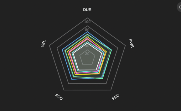
Graph Types:
Spider graph
The performance graph lets you compare selected reps using metrics: Total time, Acceleration, Velocity, Force, and Power. The data is displayed on spider graphs and standardized as T-scores, helping you visually assess and compare different variables.
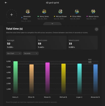
Bar chart or Table view
The T-Score graph shows how each selected rep compares to all the reps selected in this analysis. Each bar represents one rep. T-scores (0-100) standardize performance data, where a score of 50 represents group average, scores above 50 indicate better than average performance, and scores below 50 indicate poorer performance relative to the reference group.
Bar Chart: Great for a clear overview of all reps
Table View: Simple list with results
The Hits Graph shows the total number of hits (successfully deactivated cues) during a session. Each bar represents one rep. Min, max and average results are marked. Hits are calculated as the sum of successfully deactivated cues during a given task.
The Velocity Graph shows velocity score for reps in m/s. Each bar represents one session. The average group result is marked at the midpoint. Velocity is determined by dividing the distance covered (d) by the time it took to cover it (t), with distance measured in meters (m) and time measured in seconds (s).
IMPORTANT: Add “distance between timing gates” for accurate calculations.
The Acceleration Graph shows the acceleration score for sessions in m/s². Each bar represents one session. The average group result is marked at the midpoint. Acceleration (a) is calculated as the change in velocity (v_f - v_i) divided by the time interval (Δt), where velocity is the speed of an athlete in a specific direction, and time is the duration of the acceleration.
IMPORTANT: Add “distance between timing gates” for accurate calculations.
The Force Graph shows the force score for sessions in Newtons. Each bar represents one rep. The average group result is marked at the midpoint. Force (F) is calculated as the product of athlete's mass (m) and acceleration (a), where acceleration is determined by the formula a = 2 × (d / t²), with d being distance and t being time.
IMPORTANT: Add “distance between timing gates” and “athlete mass” for accurate calculations.
The Power Graph shows power scores for sessions in Watts. Each bar represents one session. The average group result is marked at the midpoint. Power (P) is calculated as the product of force (F) and velocity (v), where force is measured in Newtons (N), and velocity is the rate of change of position, measured in meters per second (m/s).
IMPORTANT: Add “distance between timing gates” and “athlete mass” in the appropriate section of the app for accurate calculations.