Step-by-Step User Flow: Using the Activity Report
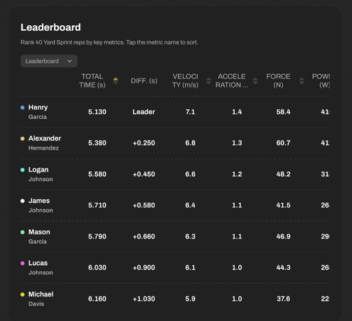
Leaderboard: Rank at a Glance
The Leaderboard gives you a real-time ranking of selected athletes (or reps) based on various metrics. Perfect for comparing multiple reps and seeing who performs best.
For timing gate-based drills (e.g. sprints) view calculated data for:
>Total Time
> Velocity
> Acceleration
> Force
> Power
For reaction lights-based drills (e.g. Follow one) view:
> Total time
> Fastest time
> Slowest time
> Average time
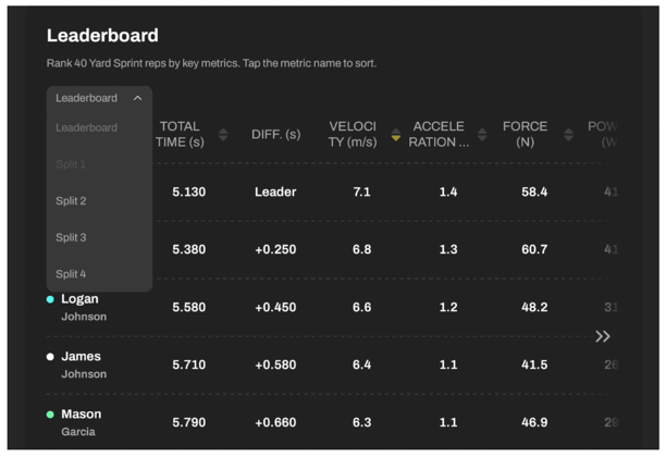
Leaderboard controls:
> Toggle between calculated data for Total time (Leaderboard) or Splits. ![]()
> Tap metric headers ![]() to sort results by fastest, highest, lowest, etc.
to sort results by fastest, highest, lowest, etc.
> Scroll horizontally to view the full leaderboard on mobile.
Scoreboard: Standardized Performance Scoring
The Scoreboard breaks down each rep and assigns a score (0-100) based on the data from the Leaderboard, relative to the selected group - you can choose to view individual reps performed by up to 8 athletes, or you select to analyze up to 8 reps performed by one athlete. T & Z-scores make it easy to evaluate performance within a group by creating standardized performance profiles. Here you can learn more about T & Z-scores, their usability and how they're calculated.
T-scores are calculated based on:
Data for Timing Drills: Total Time, Velocity, Acceleration, Force, Power
Data for Reaction Light Drills: Total duration, Average hit time, Slowest and fastest hit times, Number of hits
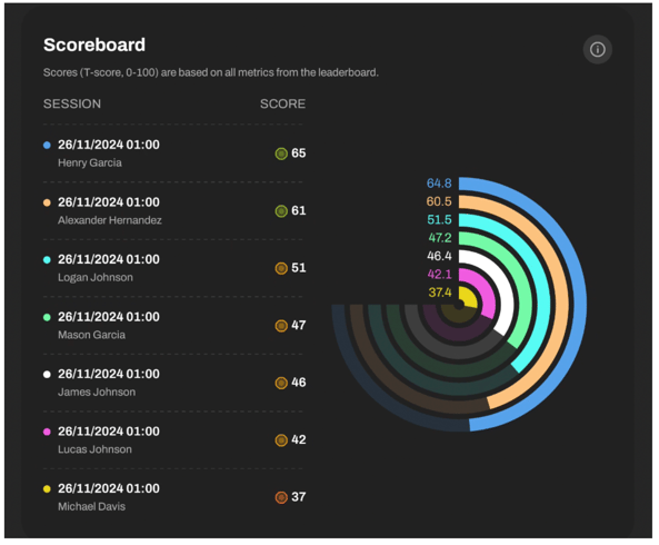
Each score has a dedicated color. Legend: The line graph below uses a color gradient from red (poorer performance) to green (better performance) to show an athlete’s relative standing compared to the team, with T-scores ranging from 0 to 100.

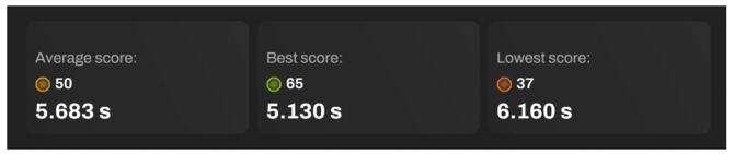
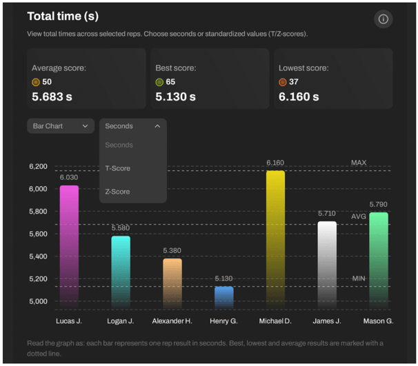
Detailed Insights Section: Total time
How to check athletes' results and total time?
After the leaderboard and scoreboard, you’ll see total time insights.
In the boxes below, you can see your:
Average score:
- average T-score of the selected group
- average total time of the selected group
Best score:
- best T-score in the selected group
- best total time of the selected group
Lowest score:
- worst T-score in the selected group
- worst total time of the selected group
Below, choose how you want to display data:
Bar Chart: Great for a clear overview of all reps
Table View: Simple list with results
And decide on values you want to see:
- Total time (and other key metrics)
- T-score
- Z-score
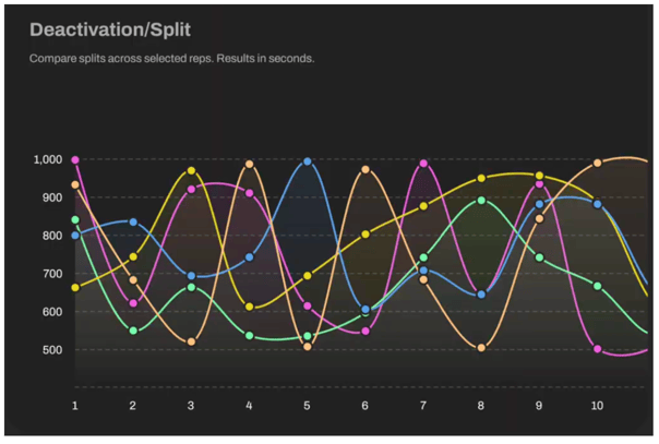
And for each drill you see a Line Chart, ideal for reaction and agility timing visualizations.
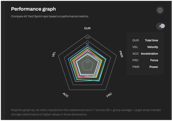
Performance Graph: Holistic Visual Analysis via Spider Chart
This powerful graph lets you visualize rep performance by mapping scores across multiple metrics.
Metrics shown depend on drill type:
Sprints: Duration, velocity, acceleration, force, power
Reaction drills: Total times, hits, min/max/avg hit
Each axis represents a T-score (0-100), with lines connecting data points for each rep.
Use this to:
- Spot trends and patterns
- Identify outliers
- Compare reps and athletes holistically
Rep Cards under the graph give you a short overview of the data visualized in the Performance Graph.
Each rep has a Rep Card showing:
- Athlete’s photo & timestamp
- Total Score: Average of all metric T-scores
- Individual Metric Scores: T-scores for each performance metric
Rep Cards include:
1) Picture of the athlete
2) Activity date and time
3) Total activity score
- Shows how an athlete performed overall, compared to others in the same group or session.
- Calculated based on all the key metrics from the Leaderboard, and standardised as a T-score for easy in-group comparison (an average T-score of all the metric T-scores).
4) Metric scores
- Each score shows how each athlete's metric result compares to the group average.
- T-scores for each metric are derived based on the group of reps you select while building the report.
Detailed Insights: Metric by Metric
After the leaderboard and scoreboard, you’ll see individual metric insights from the Leaderboard.
Each metric has its own section showing:
- Average
- Best
- Lowest scores
As in total time analysis, you can choose between:
Bar Chart: Great for a clear overview of all reps
Table View: Offers exact numerical values
Line Chart: Ideal for agility/split timing visualization.
- Group-relative scores (T-score (0–100) Z-score (-3 to +3))
Choose your preferred display:
Bar Chart: Great for a clear overview of all reps
> Charts can display:
Raw data (seconds)
T-scores (0-100, mean = 50)
Z-scores (-3 to +3, mean = 0)
Table View: Offers exact numerical values
Line Chart: Ideal for agility/split timing visualization